Requirded Questions1. Art Critism Process a. Describe the Artwork- List what you see in the artwork and describe it as if you are describing it over the phone. Describe the color scheme and images. b. Analyze the Artwork- List the different elements of the artwork and design principals; color, value, balance, harmony, movement, proportion, emphisis, line, shape, variety, texture and space. c. Interpret the Artwork- What is the mood and feeling expressed in the artwork? What ideas are being represnted and what is the story being told? d. Judge the Artwork-Do you think the artwork is successful, what do you think? Support your opinion with evidence. 2.Critique-
Additional Questions.
0 Comments
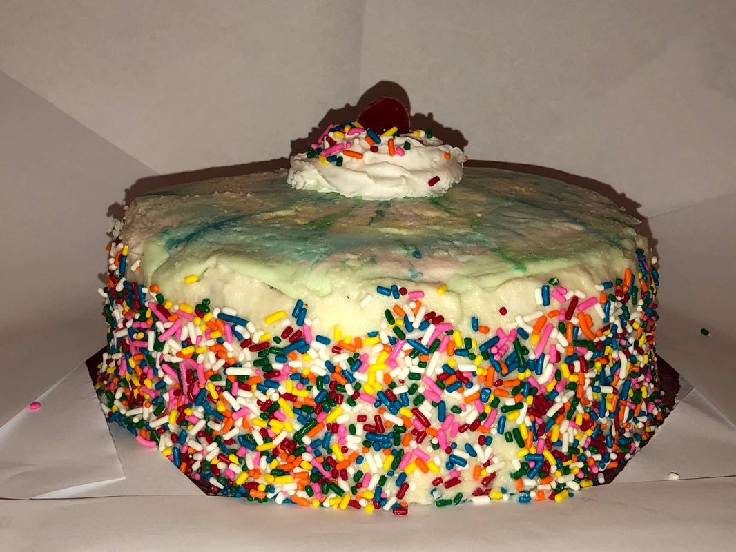
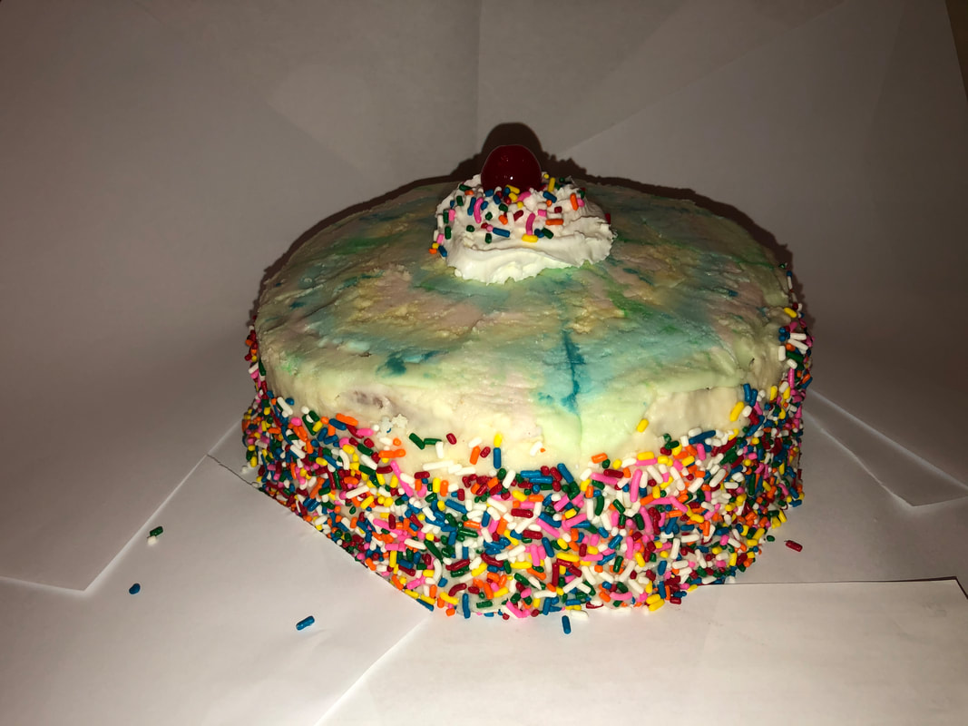
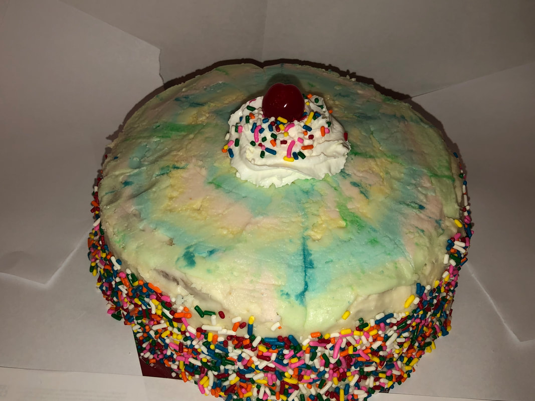
Finished Strawberry Cake with Buttercream Frosting Pros: The cake turned out great and the sprinkles stuck onto the cake well. The cake was also moist and was a great texture. The consistancy of the frosting was great as well.
Cons: The frosting was really sweet. It was good but I think I should have done a differes=nt frosting that wasn't as sweet. Process: I started by chopping up all of my strawberries and froze them. After that I combined all of my wet ingredients with an electic mixer (buttermilk, sugar, lemon juice, vanilla, etc.). I then whisked all of my dry ingredients together in a separtate bowl (flour, strawberry jello powder, baking soda, etc.). With that I slowly added the dry ingedients into the wet ingedients. Once combined I stirred in the frozen strawberries. I poured my batter into 2, 8-inch cake tins and baked them. I let them cool overnight and made a basic buttercream frosting. The next day I stacked the cakes and did a buttercream crumbcoat around the cake then let it chill for 30 minutes. After that I did a thicker coat of frosting around the sides and stuck a bunch of jimmie sprinkles to the sides. Then I made multicolord rings of buttercream on the top of the cake and swirled them to get a "tie-dye" effect. For garnish I put a swirl of whipped cream with some sprinkles and a maraschino cherry on top.
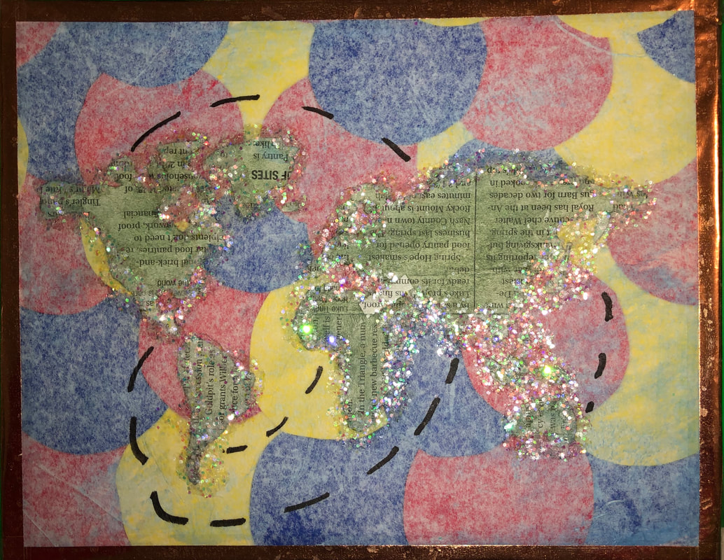
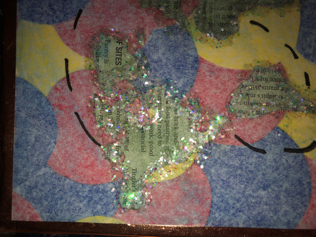
1. In my piece I used 6 different mediums. My first medium was the contruction paper in the back that I cut into different sized circles and glued randomly on the board. I then decided that the colors were just too bright so I glued white tissue paper over it to muted the colors a little bit. After that I though that the edges looked messy so I put some metalic washi tape around the edges. Then I cut out newpaper clippings into the shape of all of the continents. I decided to then use some watercolor paint to adjust the color of the newpaper. After that I outlined them in glitter. Finally I used a perminant marker to draw dotted lines conncting all of the continents.
2.My word was global. I represented this buy showing all of the land on the globe and used the dotted lines to represent a jouney around the globe.
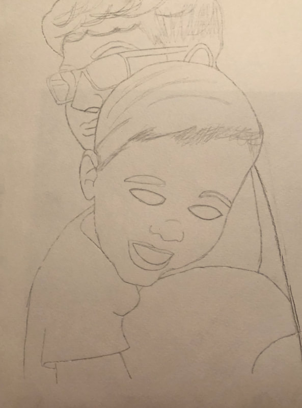
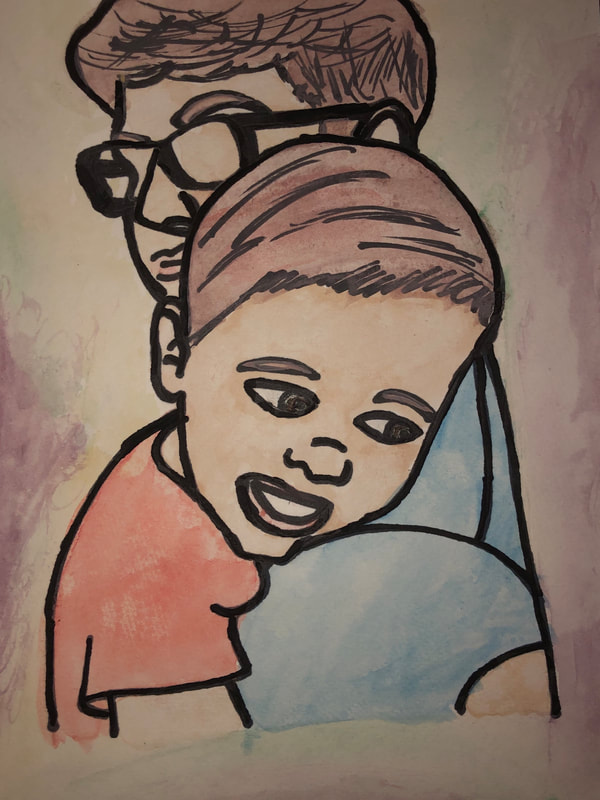
1. I drew a portrait of my older brother holding my 2 year old cousin.
2.I decided to use watercolor paints to paint my portrait. 3.I started by figuring out all of my proportions for them. I then drew in pencil an outline of the whole picture. After that I outlined all of the lines in black perminant marker. Finally I used my paints to fill in the picture and as a finishing touch I outlined the lines one more time. 4.I really like how this came out. I am pretty proud of it considering I'm not very good at drawing. If i could change anything it would be blending the background out a bit more.
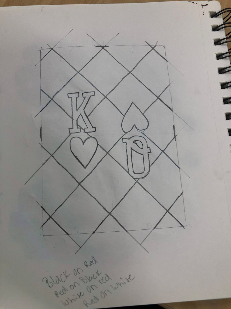
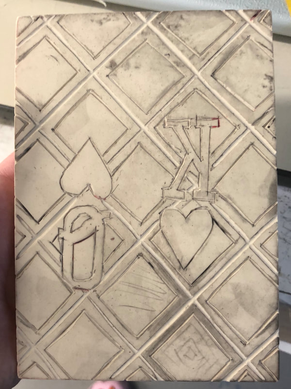
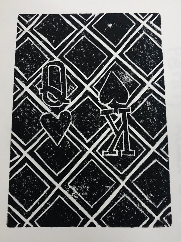
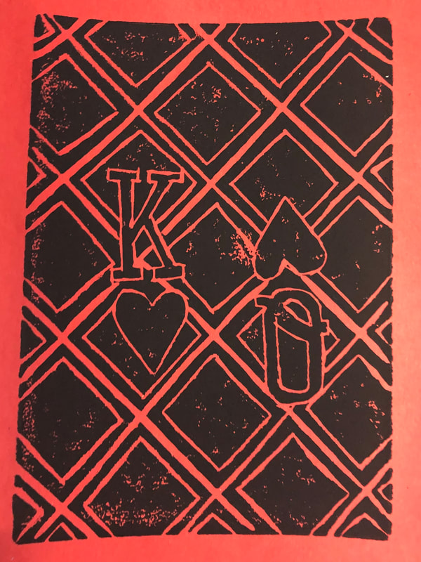
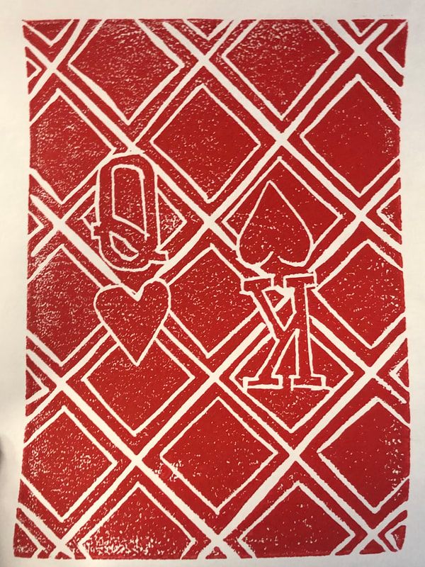
1.This project shows off the theme of line by containing different types of lines and shapes. There are straight lines, curved lines and squiggly lines. 2.My piece was successful in showing the print clearly. I'm not too sure what I would change if I did it again. I might add more paint to the print but with this design I like the faded look they have. I think I would just try to make the lines a bit more clean.
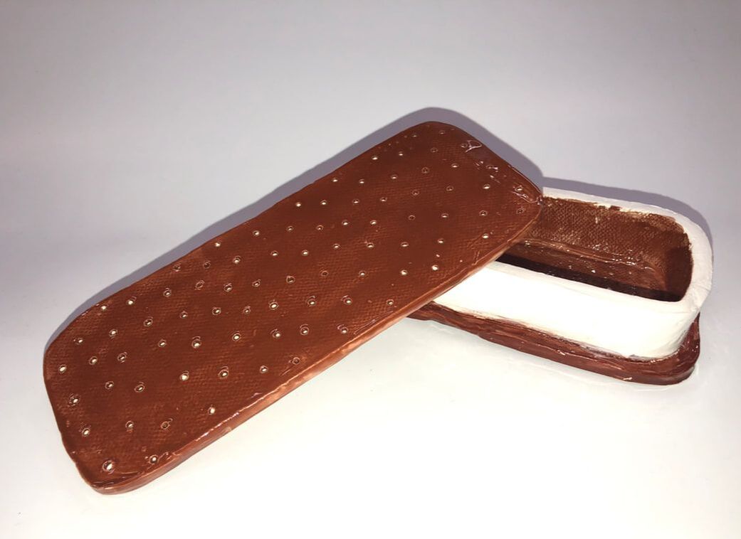
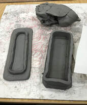
1.Since the in progress post I had finished forming the shape of it and adding the holes on the top of it. Then we fired it and after that I glazed the vessel and fired it one last time. 2.I believe this piece to be successful in being pretty easy to tell what it is. Everyone who looked at knew what it was. It was also successful in being a vessel; easily open and closing with a secure lid, not being fragile as to where putting too much in it would break it. 3.If I did this project again I would try to be a bit more careful with the glaze and take a bit more time to clean it up.
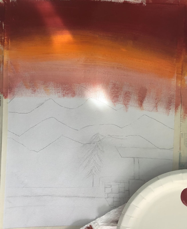
For me the most helpful warm up was the hue value scale. It helped me with mixing the colors for my mountains.(I can't find it, therefore can't take a picture of it.)
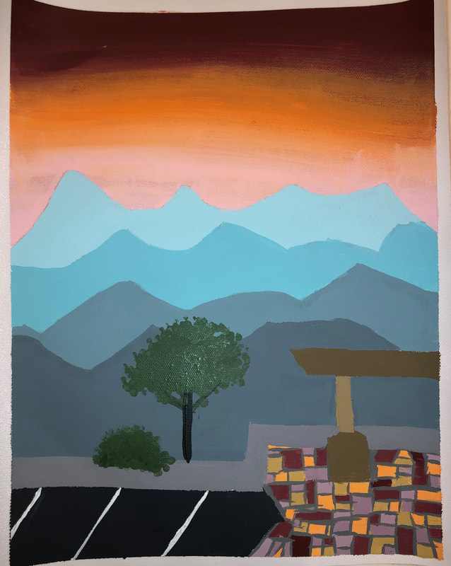
1. The place represented in my art is the view from a parking lot at Western Carolina University of the blue ridge mountains. I came to these mountains growing up and loved seeing them. This was also one of my first college tours which was exciting. 2.The part I found most challenging about this piece was painting in all of the colorful tiles as well as creating the colors for them. 3.One thing that I find successful about this piece is the different shades of the mountains and the shape of them. 4. My process started with me not having any idea what to pain and just picking a random picture from my camera roll. I then sketched it out onto my canvas paper. After that I rippd pieces of paper into the shape of mountains. I then taped one down and painted the sky. With the paper down it was so much easier to paint the sky and not worry about loosing the mountain shape. I repeated a similar process in painting the other mountains. I then sorta just filled in the rest and let it dry. |